


This is a simple article on how to create a dropdown menu with just bootstrap for those that have been having issues doing that. So in this article I am going to be explaining in detail on how to do that, but before then i will list out the prerequisite of creating the dropdown menu.
THINGS YOU NEED TO KNOW
- So first of all you need to have basic knowledge of html and css.
- Secondly, you also need to understand what bootstrap is all about.
- Thirdly you need to have a working computer.
- You need to have your code editor software installed e.g vscode or sublime, I will recommend sublime or vscode for this tutorial.
OUTLINE OF CONTENT
1.What is Bootstrap?
2.How to Install and Setup bootstrap 5
3.Creating the Stylish Navbar with bootstrap
So with that being said, let's start breaking down everything step by step. Also as long as you have those requirements, you won't have any issues understanding the whole article.
We are going to be breaking it down to 5 different steps all of which contain images of the codes used and how to create them.
WHAT IS BOOTSTRAP?
Bootstrap is a free and open-source CSS framework that stands out from other css frameworks. It is directed at responsive, mobile-first front-end web development. It contains css and JavaScript-based design templates for typography, forms, buttons, navigation, and other interface components. It makes work easier and saves time as well.
HOW TO SETUP BOOSTRAP 5
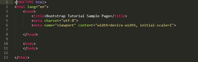
STEP1. Create an HTML Page
As a first step in this tutorial, we will create a simple HTML template as a base where we will use Bootstrap. For that, the first thing you want to do is create a folder on your computer or server for the project files. In this case, we will simply call it bootstrap or any name that you like. Now let’s create a new text file and call it index.html, Open it with a text editor of your choice either vscode or sublime and then type the html code shown in the image below .
Remember to always save when your done, so you don’t start afresh.
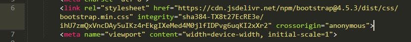
Step 2. Load Bootstrap via CDN
So the second thing you need to do inorder to start using boostrap 5. Is to load your boostrap through CDN which is known as a content delivery Network , so basically CDN can be loaded in the header and footer of your web page like other assets such as custom fonts and icons. Bootstrap as a framework offers a CDN (content delivery network) access path for that. You can find it on the Bootstrap download page whenever you visit the website,make sure you scroll down to find it. To get Bootstrap into your page, simply write the code on the image below, write inside the section of your template.
Always make sure your using the actual or main link from the boostrap download page, and always remember to save. However, for experimenting and development, or if you want to be independent of an Internet connection and use boostrap locally from your Computer you can also do that but, am trying to make this article as brief as possible so i won’t be going into details on how to do that.
Creating the Responsive Navbar with Bootstrap
STEP 1. Open your code editor and go down to your body tag and press enter, then type the code shown on the image below.
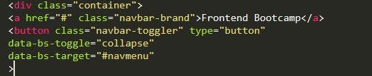
Once that is done make sure you save your file.
Output :

STEP 2. Open your code editor and go down to your body tag and press enter, then type the code shown on the image below.
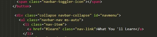
Because boostrap already has built in media queries there is no need to start Using it here, instead we use ms-auto and other tags or elements for various screen size
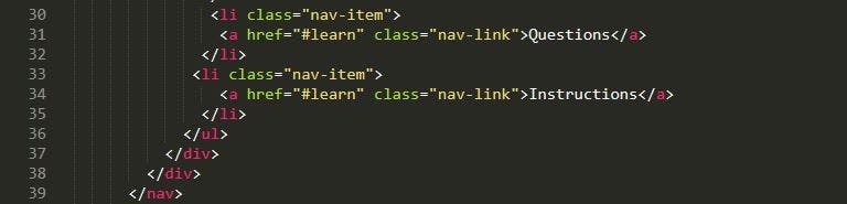
STEP 3. The Final Step Make sure you copy and paste the a href Tag 3 times and rename the code as shown on the image below.
 FINAL OUTPUT
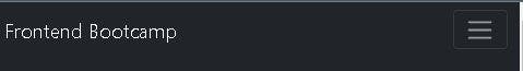
Finally we have our responsive navbar test it on all screen size and you will see the difference. So if you followed this article successfully it means you have fully built a responsive navbar menu with boostrap 5, and might have learn’t a thing or two on what boostrap is all about and how to set it up on your own, so hope this article was helpful,thanks for taking your time to read this, i will love to see your comments.